
When you ask what is memorable about a site, few people mention the footer. Since viewers don’t regard the footer with much importance, neither do designers – “end of site, out of mind,” so to speak – but this kind of thinking is old-fashioned. Your website’s footer can be both eye catching and functional, and with a little work it can become an essential part of the design.

Why Include a Footer at All?
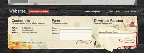
Traditionally, the footer is the place to put copyright information, your email address and sometimes your mailing address. Contact information is typically also included in a contact section of a website, though, and you could probably work the copyright into a different spot if necessary. Short of giving your pages a distinct end, why should you really even include a footer?
Footers have several advantages over any other section of the site:
- Like the navigation bar, they repeat on every page of the site;
- Unlike the navigation bar, they are not required to contain only navigation links; and
- They’re at the bottom of the page, where users naturally end up after scrolling down to read each page
How to Make a Footer Useful
In a nutshell, your footer should contain only things that you want the user to be able to access instantly, no matter what page of your site they are viewing. This isn’t the place for witty text (trust me, even the best joke in the world gets dull after you read it 10 times) or heaps of pictures (remember, they have to reload each time the user visits a different page, even though they look exactly the same!)
Things commonly found in website footers:
- Contact information (email address, mailing address);
- Simple contact form;
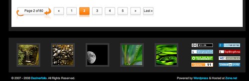
- Link to the site map;
- Copyright information;
- Links to other sites the user may enjoy; and
- A link back to the top of the page
In essence, give the user something to do or somewhere to go in the footer, and you can hardly go wrong.
Clean Design Is Key
Clean, high-contrast text with large headlines makes your footer easy to scan, which is perfect for the viewer who has just finished reading the current page and needs to know where to go next. Another tried-and-true technique is to divide the footer into several columns to provide more white space. White space makes the text easier to read at a glance, and looks nice and clean, too.
Put the “Fun” in “Function”

Now that your footer is easy to read and provides useful information and links, you’re free to get flashy with the design. Another advantage of footer design is that it’s actually encouraged to make the footer mismatched from the rest of the site.
Ways to make your footer more eye catching:
- Easy-to-read fonts;
- Colors contrasting with the rest of the site layout; and
- Content more interesting than a copyright notice
In Conclusion
Great information with bad presentation or a gorgeous design with useless content are equally ineffective. Aim to catch viewer’s attention, then give them something worth paying attention to, and you’ve succeeded at designing a useful footer.
I find this topic very useful since I am relatively new to Web Design. I designed my first website which was supposed to render special German characters but it didn’t. I used the UTF-8 character code. Which will be a better option to render this special characters?
Thank You